Safe.Global
Safe holds funds no single person controls. I redesigned onboarding, signing and the design system so first-time teams trust it, not only power users.
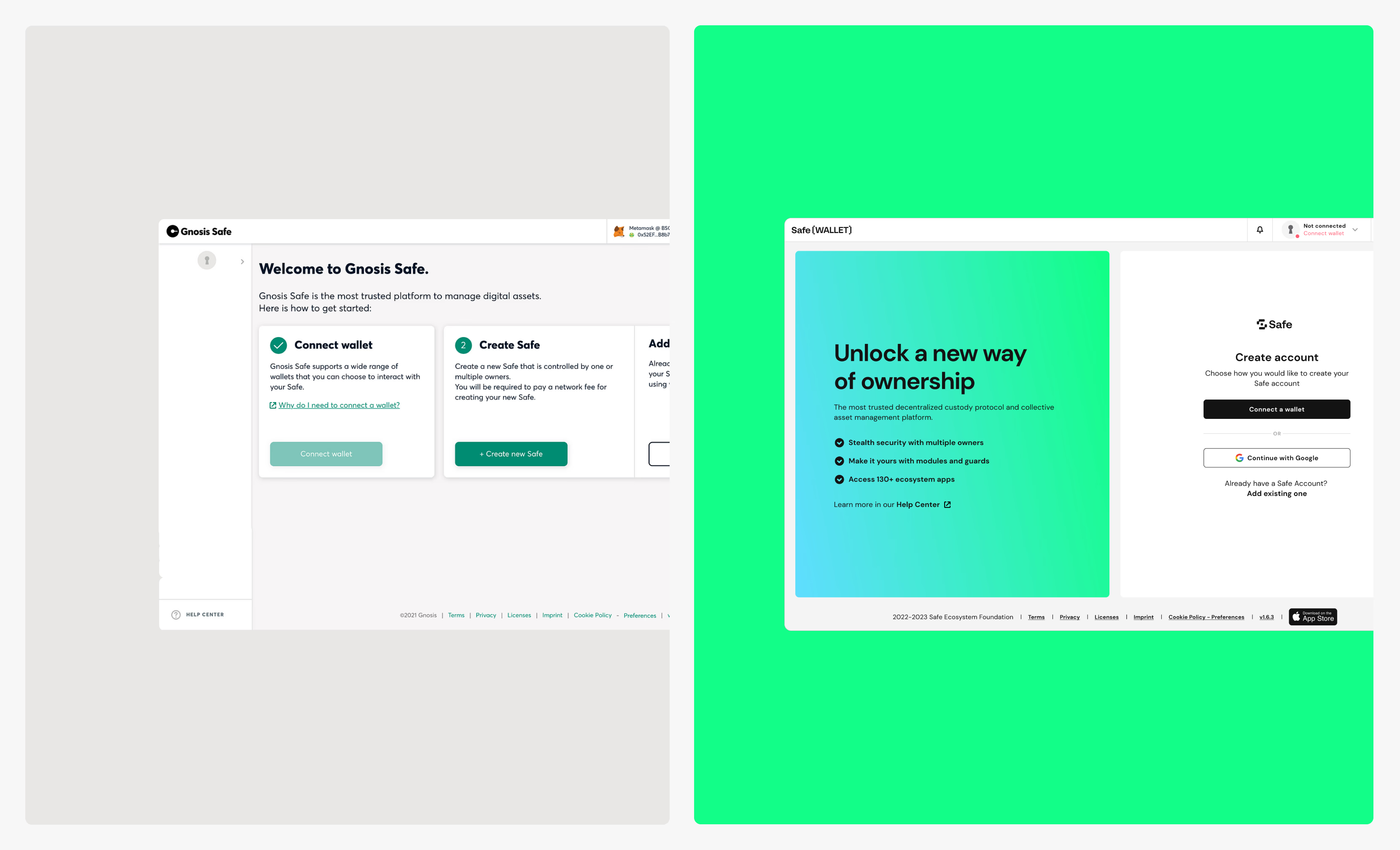
From power-user tool to platform
Safe is a multi-signature wallet: every transaction needs approval from a set group of signers. DAOs, protocols and treasury teams use it to hold shared funds.
When I joined, it was turning from a power-user tool into a platform. The audience widened to first-time teams and DAO treasurers, and the interface had not kept up.
Company scale today, not my result: $60B+ in assets, 60M+ accounts, $1T+ in volume (safe.global, 2026).
Every decision carried risk
- Only power users used Safe. The goal: retail users and first-time multisig owners.
- First-time users dropped off before their Safe existed.
- A first transaction took many steps, with an unclear security model at the moment of signing.
- Inconsistent signing modals, undocumented states.
- Batching existed, but most users thought it only worked for transfers.
- Safe spun off from Gnosis. External developers would build on it with no shared design language.
- The token launch had a fixed date, live tokenomics and external contributors.
In a product holding billions, a confusing screen means a lost signature or a signed mistake.
Fear blocked completion more than complexity
- Retail users knew what to do. They feared losing money and making a mistake they could not undo.
- My bet: fear, not complexity, blocked completion. Three small changes tested it: +9% completion, tickets down.
| Finding | Evidence | Change |
|---|---|---|
| People knew the steps but feared losing funds | Interviews, moderated tests | Security tips, tooltips at decision points |
| Nobody knew if deployment worked | Moderated tests, support tickets | Live deployment status |
| Paying gas before trying the product felt risky | Research sessions | Pay now / Pay later |
| Signers could not see what one signature covered | Unmoderated tests, analytics | Transaction page with grouped actions |
What I built, and how
1. Fast user activation
Round one: trust at the decision points
- Tooltips where people hesitated
- Security tips matched to the number of signers
- Live deployment status, so nobody wondered if the Safe existed
Result: +9% onboarding completion, fewer support tickets.
Round two: reach the product before paying
Problem: wallet features were hidden behind the payment for deploying the wallet on-chain. People hit a cost before they saw any value.
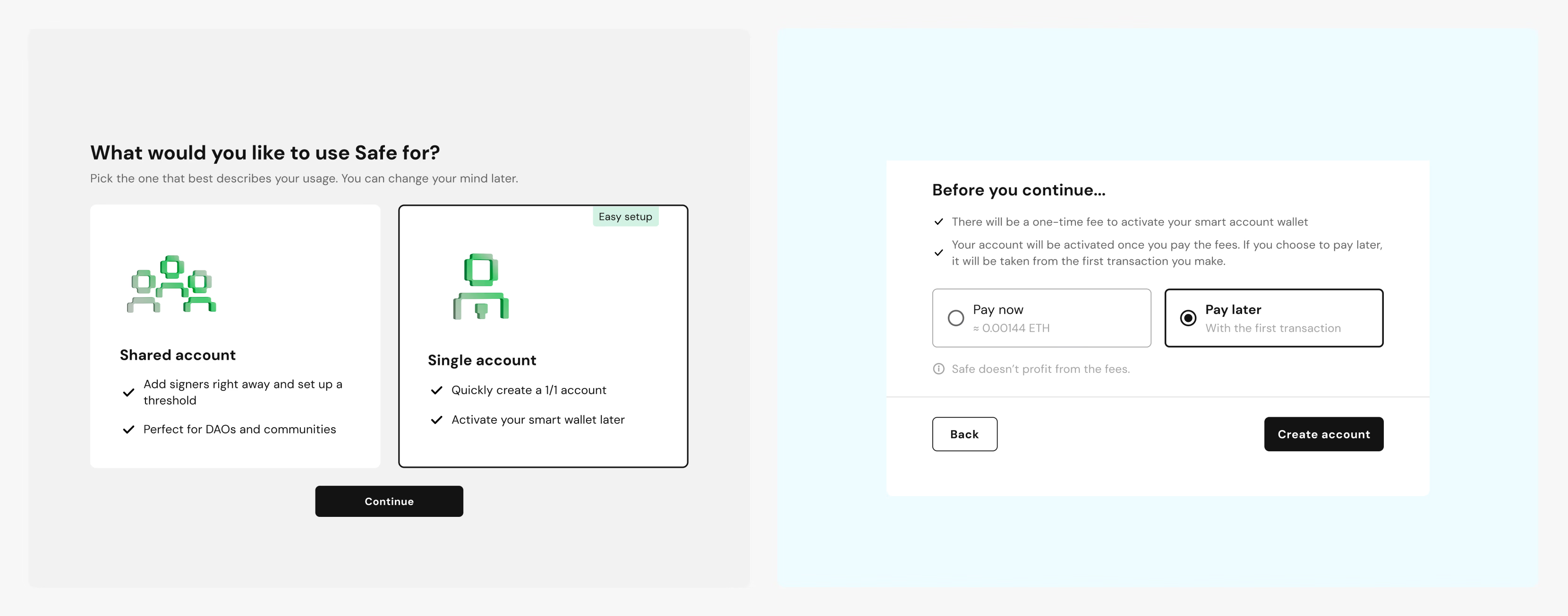
Fix: I fast-forwarded that decision in two steps, so users get into the UI faster:
- Who will use this account: one person, or a shared team
- Pay now or pay later: defer the fee and open the wallet right away
Result: +7% Safes created.
2. A modular transaction approach
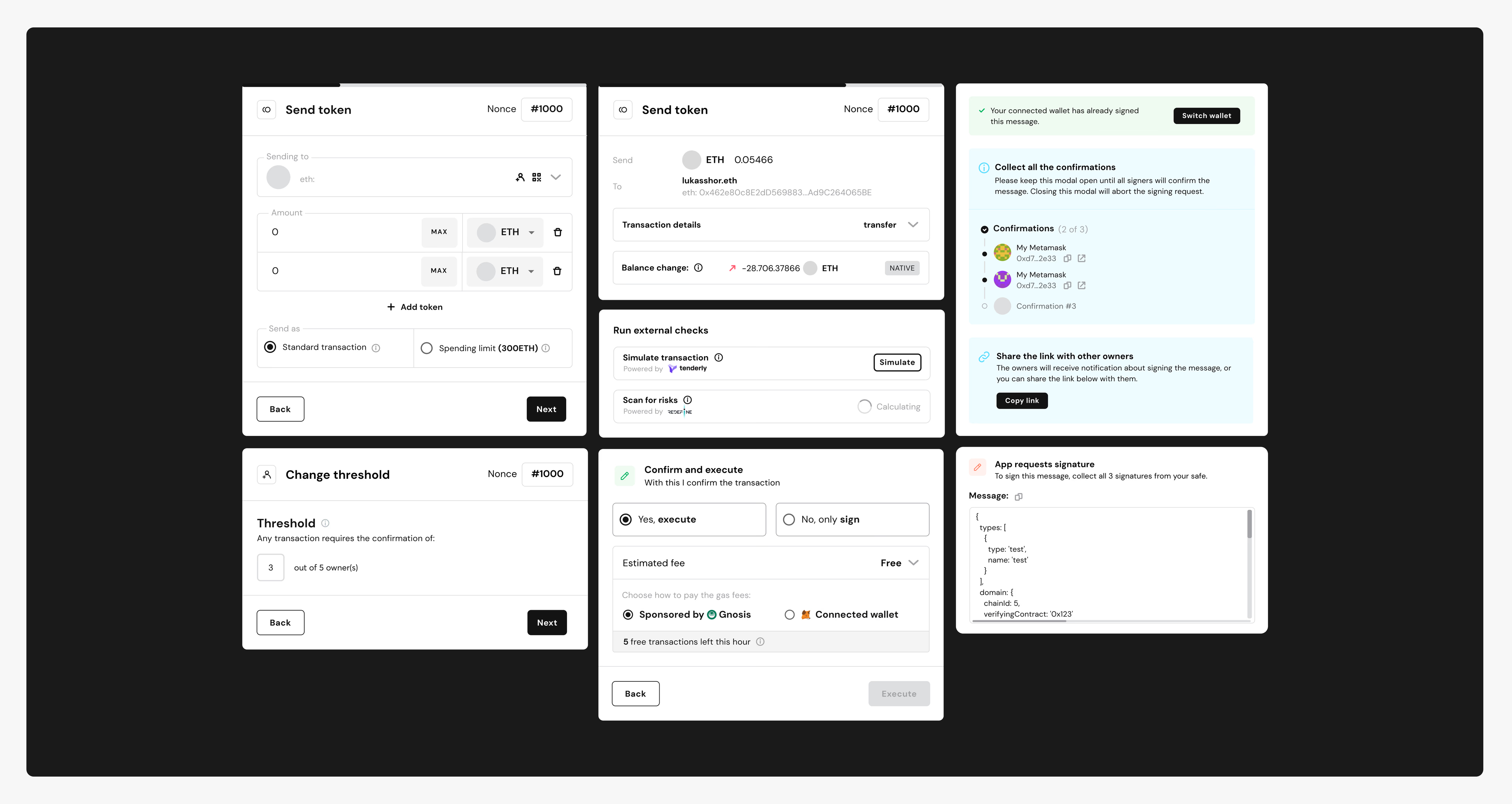
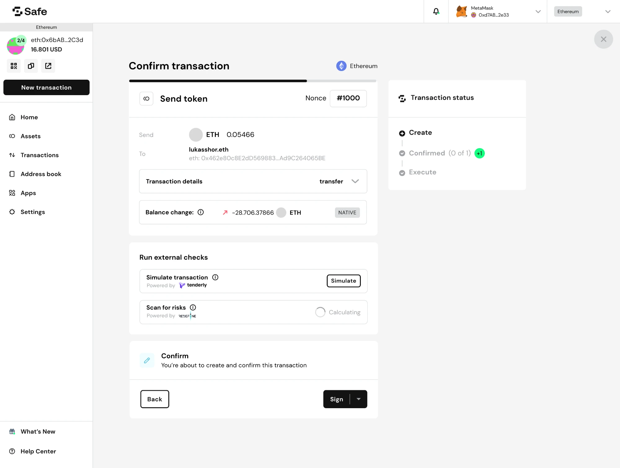
The team wanted a full-screen container. I asked to document every transaction type and state first.
One signing event carries several action groups, each with its own status. A modal could not hold that. The fix: a dedicated, modular page. Blocks are grouped by meaning, every status and signer step is visible, and security shows before the signature.
Every action is a block, so batching fits the same system. Batching lets people do more in one signing event: power users get a better UI, and retail users get the same power.
- An always-visible entry point for batching
- Reordering, to control gas and execution order
- Empty-state guidance, since most users thought batching only covered transfers
Result: +13% executed transactions.
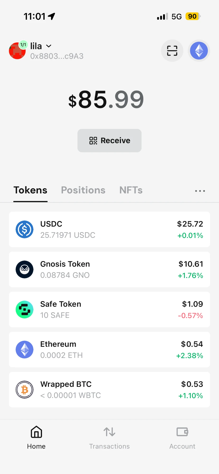
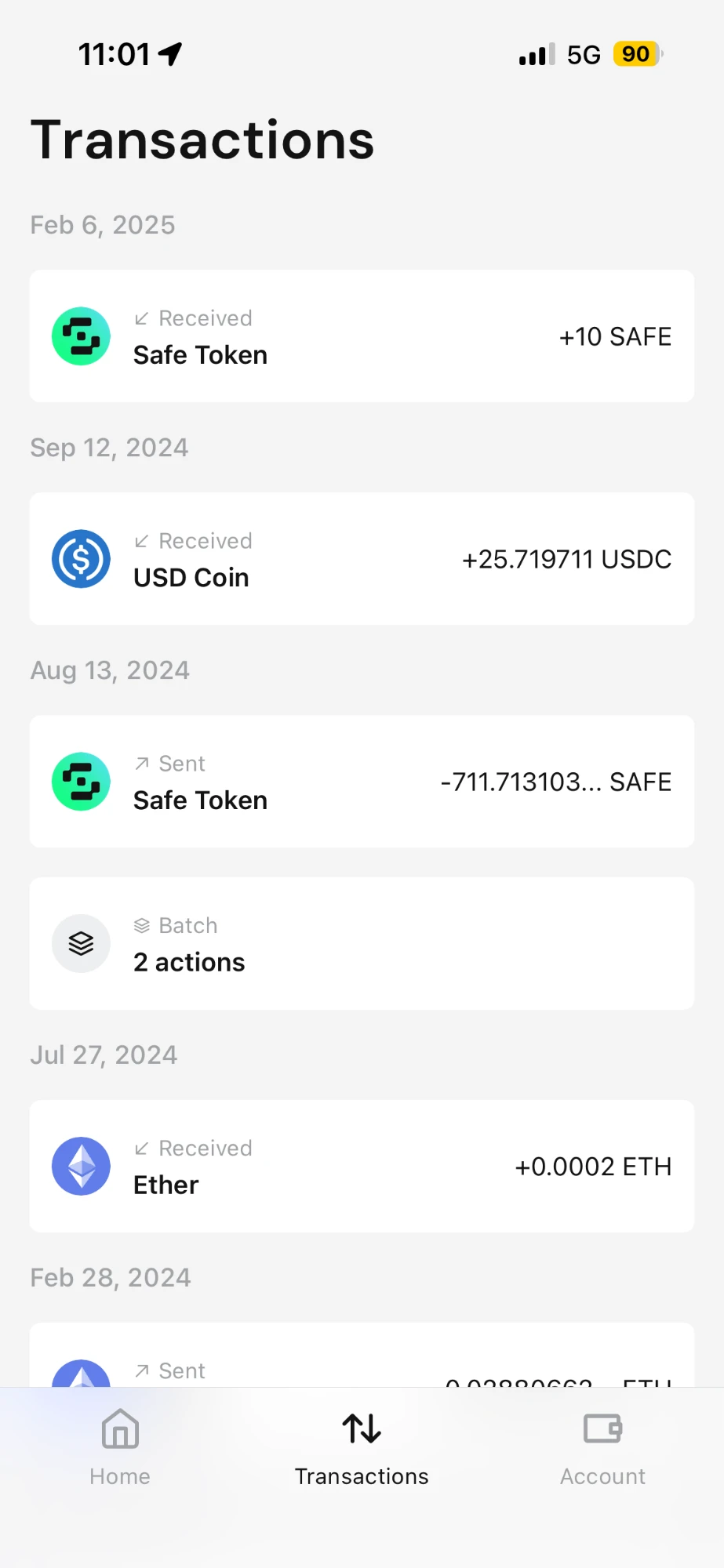
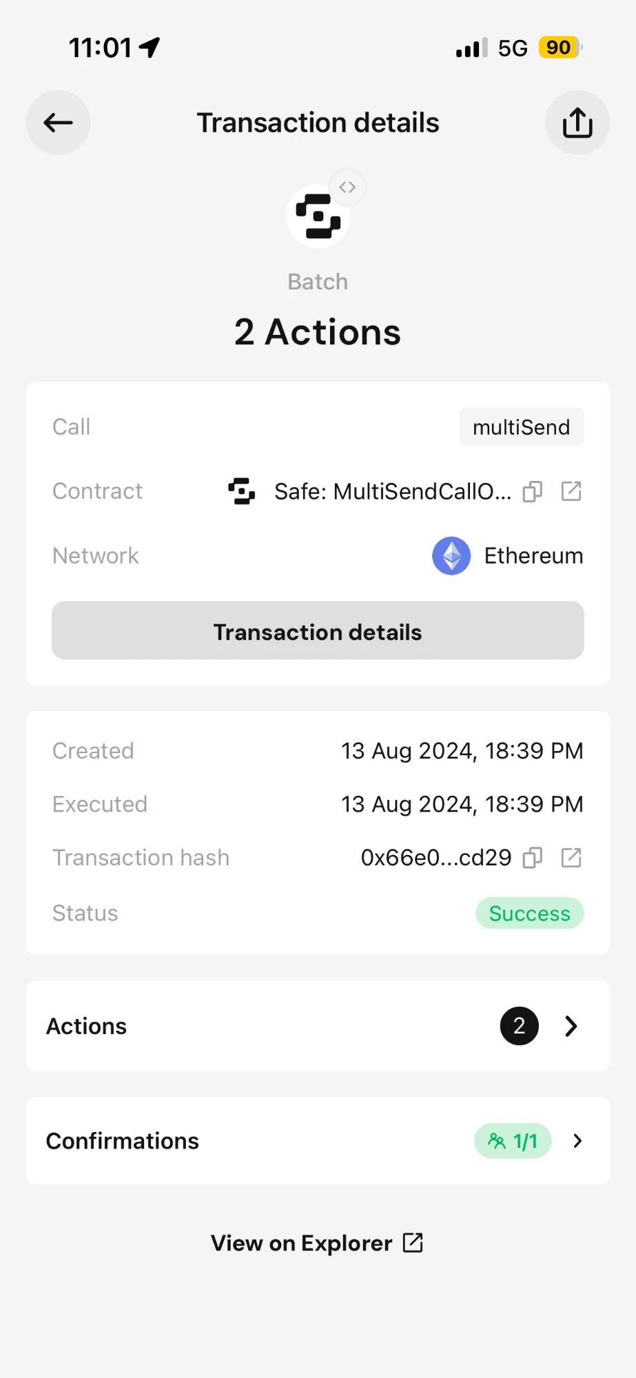
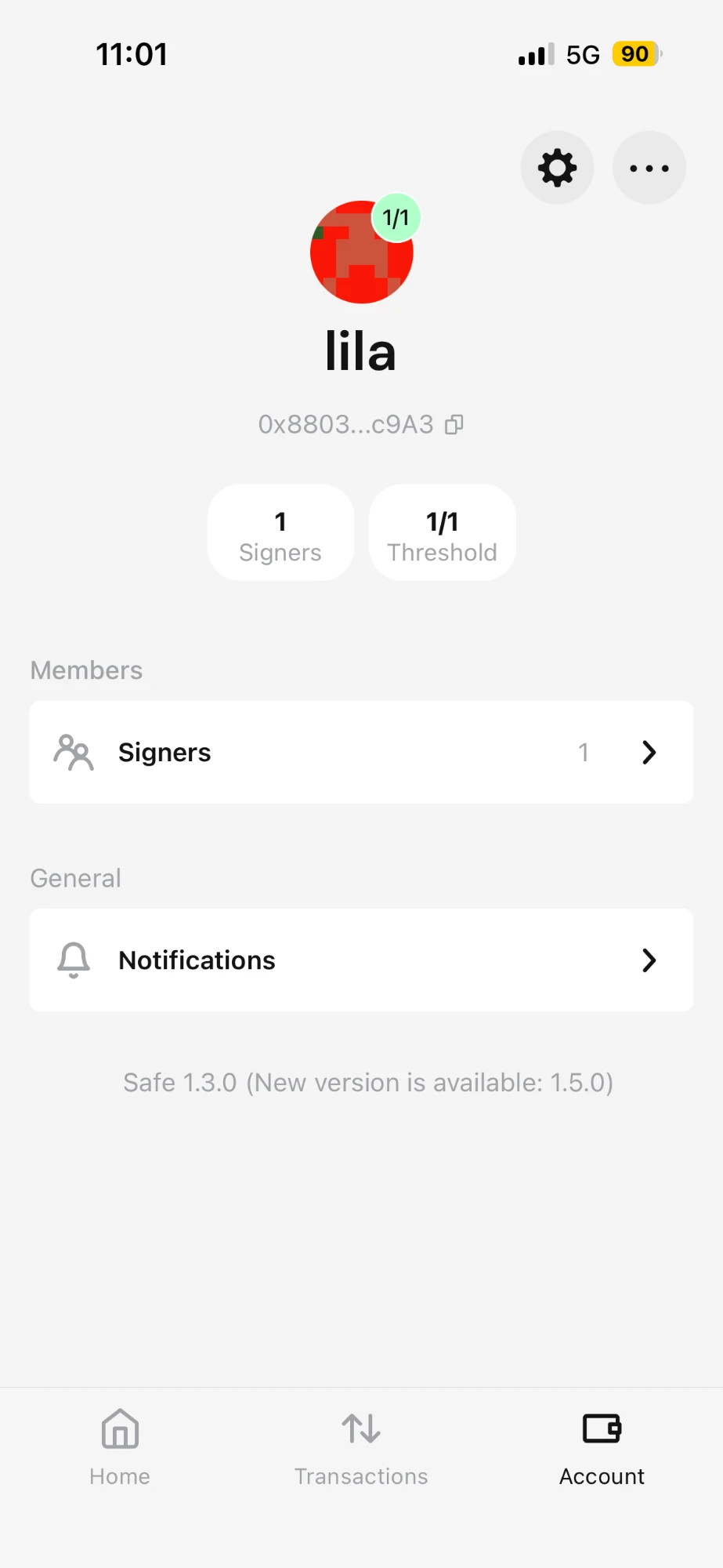
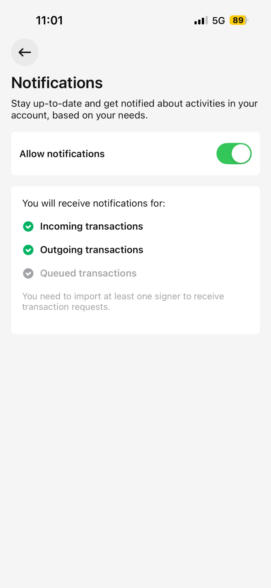
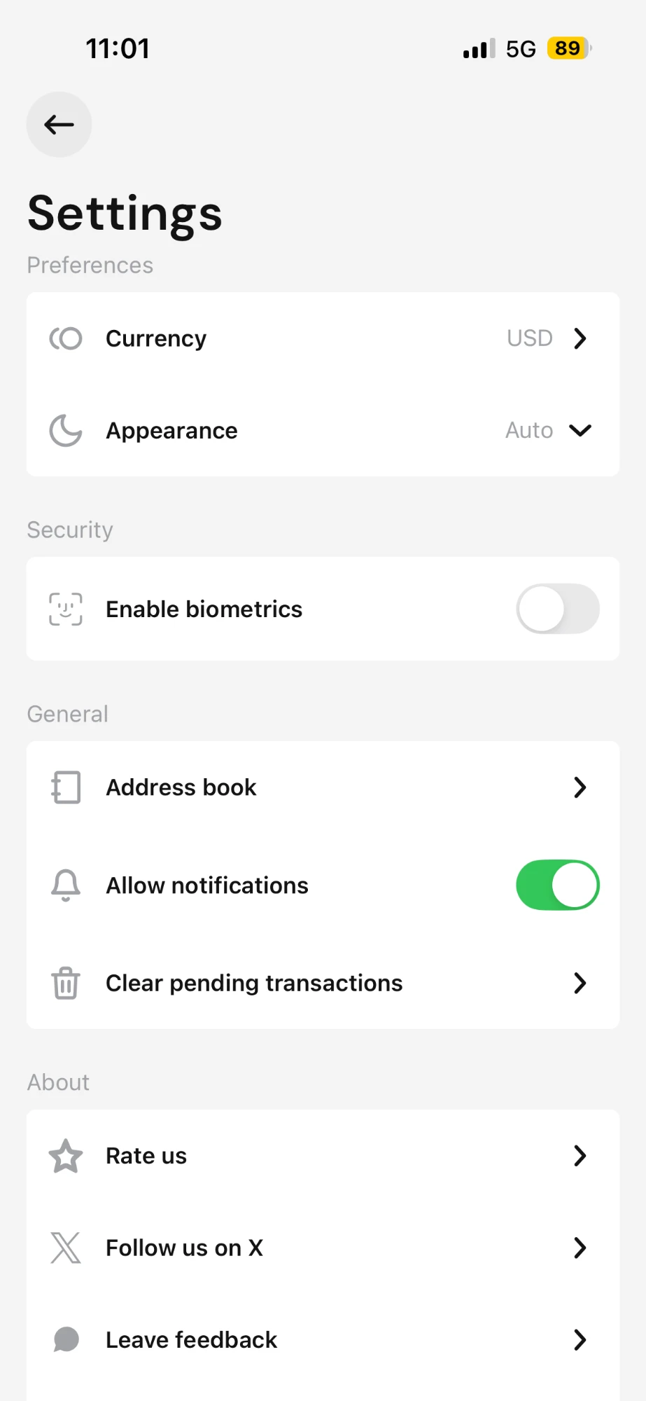
3. Mobile as a signing companion, not a copy
Built for what people do away from the desk:
- Balance and holdings at a glance
- Full transaction history
- Review and sign, with the phone as a signer
- Signer setup and threshold management
- Push notifications for activity that needs a signature
4. A design system to empower the ecosystem
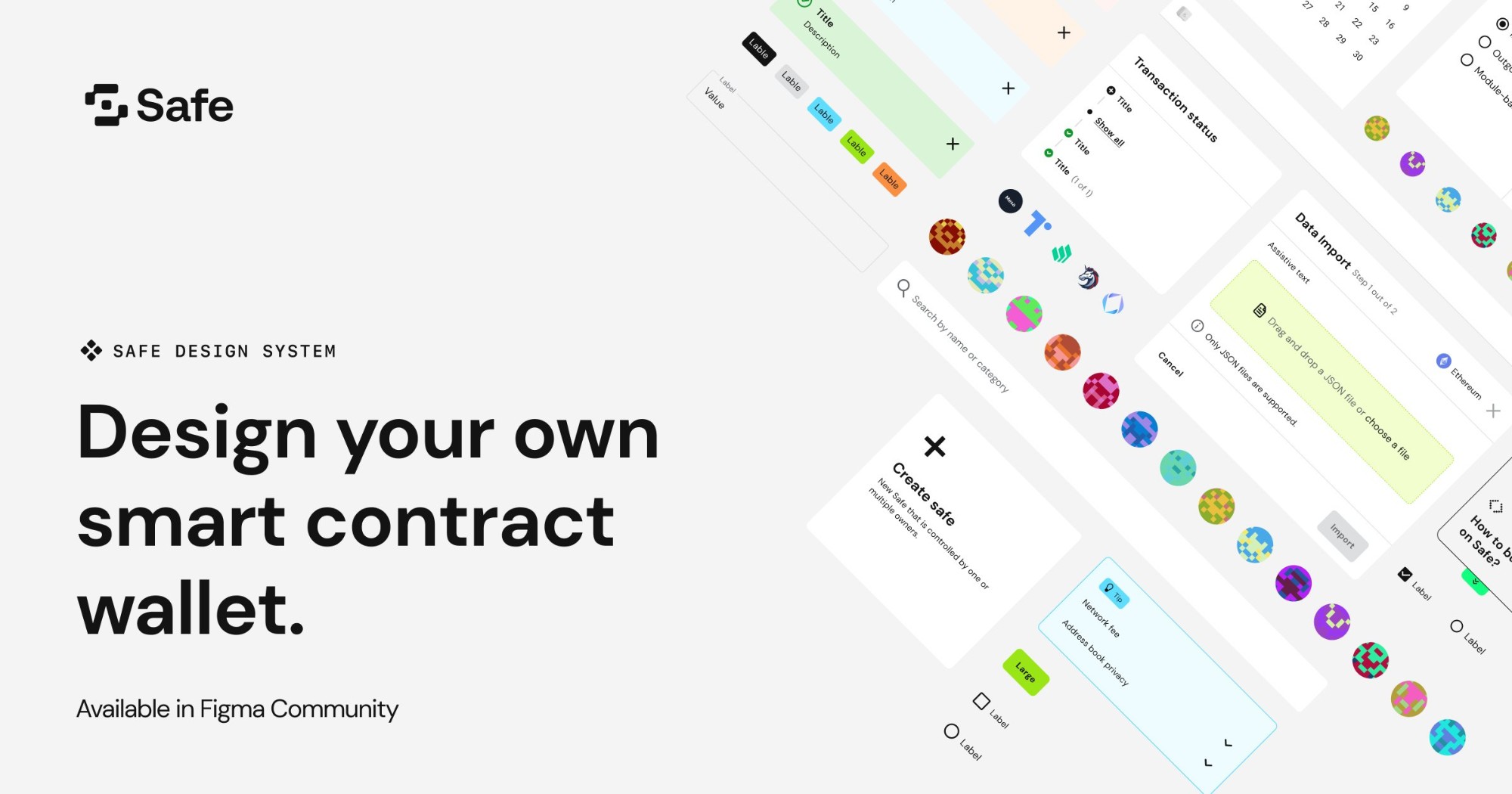
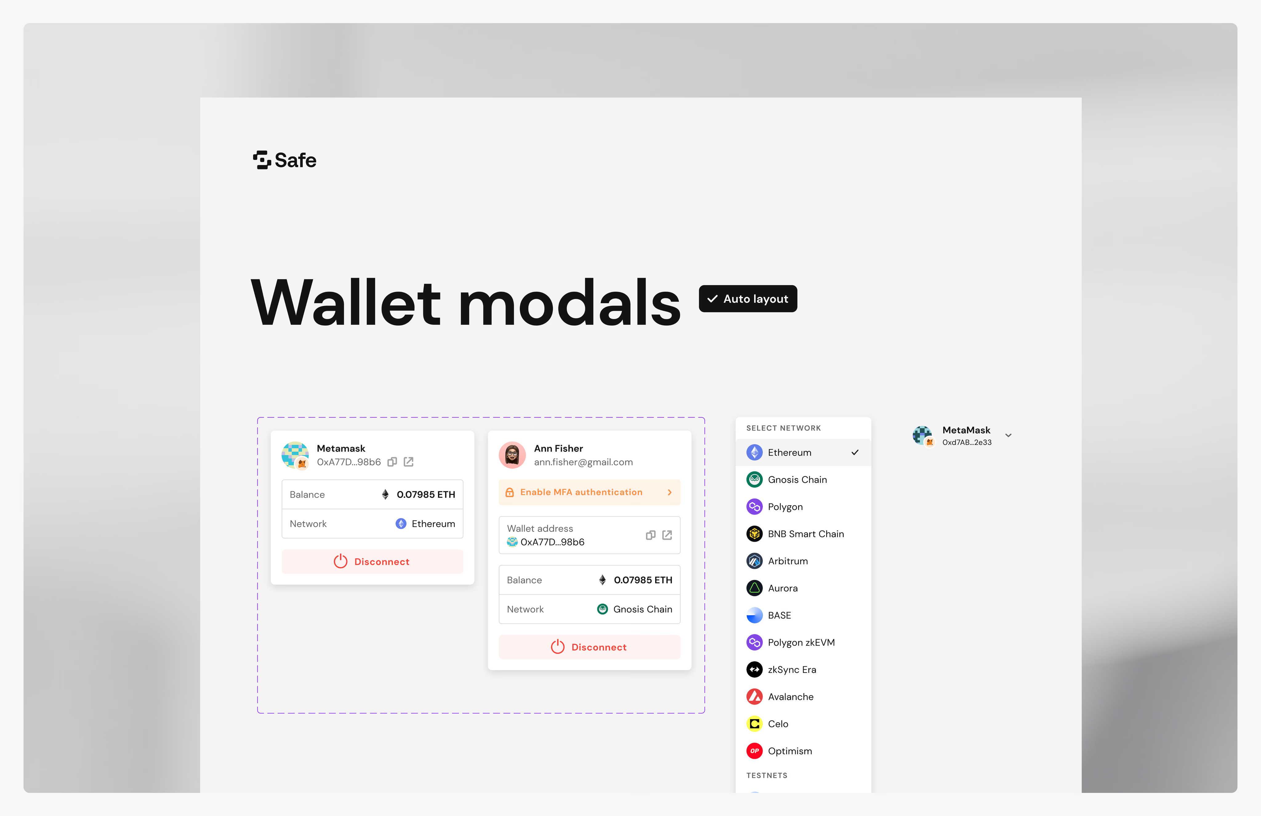
Safe became a network of apps. Outside developers needed to build interfaces that match Safe. I adapted Material UI to Safe's standards:
- Design tokens for white-labeling and future themes
- A Figma library of components carrying the decision and the reason, not only the look
- Contribution documentation for external teams
The test: could a stranger build this correctly without talking to me? Result: 1,000+ Figma copies in month one.
5. Token launch under a fixed date
- Claim: airdrop claiming with eligibility checks and gas-aware confirmation
- Delegation: choosing and changing a governance delegate
- Safe Pass: token locking, with boost shown as lock amount times time
Safe Pass was the hardest. Boost logic had to read as simple, not intimidating.
What I chose, and what it cost
Options: full redesign, or targeted changes in rounds
Chosen: targeted changes in two rounds
Gave up: a visible "new onboarding" launch
Options: separate flows for individuals, DAOs and developers, or one modular flow
Chosen: one modular flow. It tested better and avoided three flows of design debt.
Gave up: tailored messaging per persona at step one
Options: patch the modal, go full screen, or map states first
Chosen: map every state, then design the page
Gave up: speed to the first visual
Options: full parity with web, or a focused companion
Chosen: a companion built around signing
Gave up: complex actions on mobile, like building batches
Trust became the product
- Users: +9% onboarding completion, +7% Safes created, +13% executed transactions.
- Platform: 1,000+ Figma copies in month one. External teams built on shared patterns.
- Team: one state reference for engineering, product and contributors.
- Direction: Safe later shipped human-readable transactions, simulation and biometric mobile signing. Same principle: show people exactly what they sign.
Unvalidated:
- Whether reduced fear kept users active after onboarding, or only got them through it
- How external developers used the system after month one
Learned:
- Reduce fear and build trust before teaching anything.
- Map every state before choosing a container. The container follows the content.
- Developer-first is not user-first.
- Good answers came from working closely with engineers, product leads, brand designers and contributors.
Beyond crypto: shared control of money is the same problem in a family health account, a nonprofit treasury or a care team approving payments. Approvals, roles, visibility and recovery work the same way.