EARN'M
Targets are goals, not measured results.
A team with no design direction, and me to set it
Rafli runs online sweepstakes inside the EARN'M rewards ecosystem, from cash pools to graded collector cards. Every draw uses Chainlink VRF and an on-chain commitment, so anyone can verify the winner. A free entry route exists by law; paid users buy monthly credit packs.
Design had no owner: one freelancer on demand, two business developers and three engineers, no shared visual language. My job: set the direction, spread a design culture, and build much of the product myself.
Several consumer apps under EARN'M each had their own login, wallet and navigation, and were heading for a merger. The parent company, Mode.Inc, spoke to partners, hosts and brands through its website. Design touched product, merger and company brand.
Three product problems, five leadership ones
In-product feedback and community channels pointed to three problems:
- Users dropped off before their first entry.
- Reward value was unclear at the moment of decision.
- Few people came back after a first win.
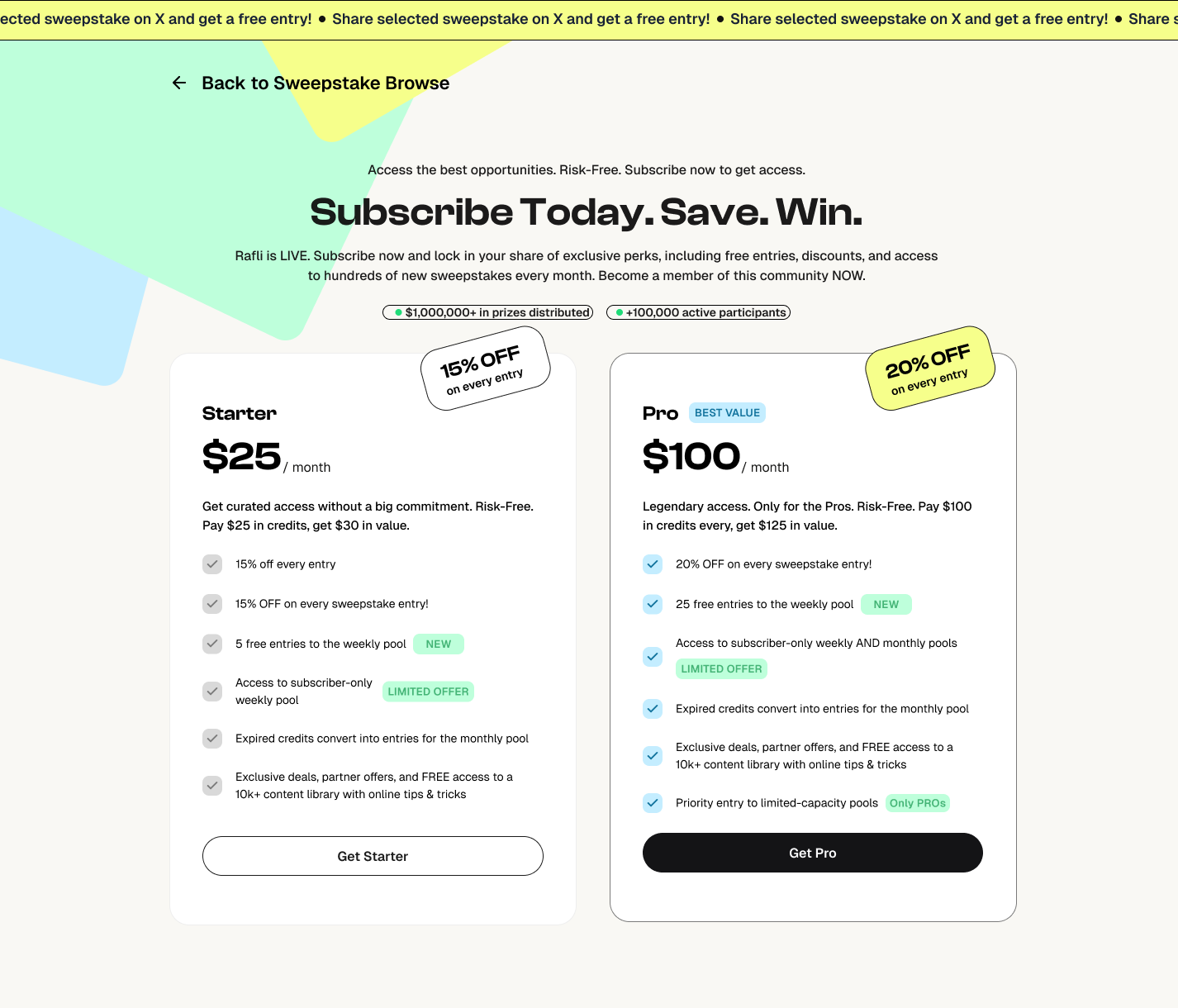
Constraint: the business planned to lead pricing with the $25 and $100 packs.
Leadership challenges:
- No design owner, shared visual language or review process
- Several apps with separate logins, wallets and navigation, heading for a merger
- A company website with no shared brand system
- Non-designers building with AI, with no rules for quality
- No definition of done, so quality depended on who built the screen
Head of design without the title
Five areas carried the leadership work.
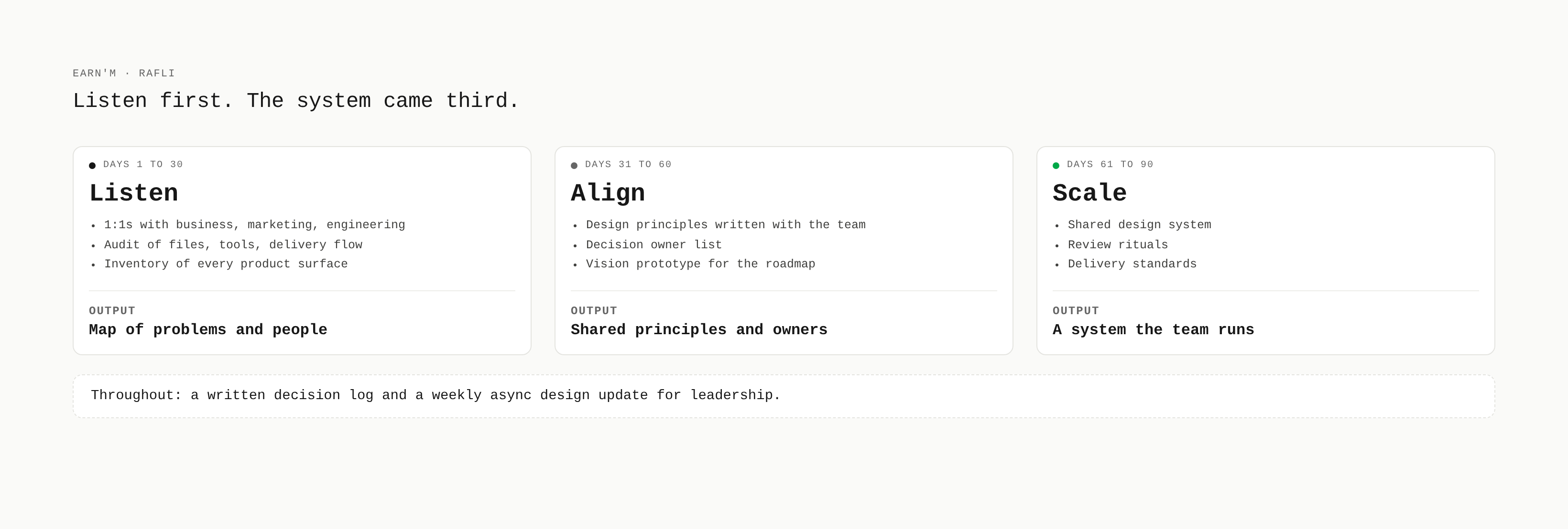
1. First 90 days as design lead
- Days 1 to 30, listen: 1:1s with business, marketing and engineering. An audit of files, tools, delivery flow and every product surface.
- Days 31 to 60, align: design principles written with the team, a decision owner list (who decides, who reviews), a vision prototype to anchor the roadmap.
- Days 61 to 90, scale: the shared system, review rituals, delivery standards.
- Throughout: a written decision log and a weekly async design update for leadership.
2. Merging several apps into one
The EARN'M and Rafli merge sat on the parking list with an owner and a review date. I scoped the approach:
- Product inventory: every feature on one board, sorted into keep, merge or kill with usage data
- Top-task analysis: users vote on the tasks they come for, so navigation follows real demand
- Card sorting and tree testing to validate one information architecture before any screen
- Service blueprint: front stage, back stage, support and payments across apps in one view
- Identity and balance migration: one account and wallet, rewards and credits carried over with a clear receipt
- Principle: one account, one wallet, one entry flow
Targets: zero lost balances, migration completion above 90% before sunset, support tickets per migrated user below the pre-merge baseline.
What I built, and how
1. Decide what to build next
I ran a remote workshop, "What We Build Next", with business, marketing and engineering. We framed the goal, reviewed the signal, then dot-voted. Three dots each, silent vote first, discussion after.
A recreation of a "What We Build Next" workshop I ran: pains ranked by dot vote, turned into a small, owned set of decisions for the next cycle.
Repeat engagement won the vote, but I argued to fix onboarding and reward clarity first: nobody repeats without a first entry. The room agreed. Competitor synthesis and the EARN'M and Rafli merge went to a parking list, each with an owner and a review date.
Signal behind the vote:
- Moderated usability sessions: 5 to 8 users per round on the first-entry flow, tracking task success and time
- Unmoderated tests: first-click and 5-second tests on pricing and the draw page, 30 to 50 users each
- Surveys: in-app intercepts after a first entry and after a loss, plus a quarterly trust survey
- Business analysis: funnel and cost per acquisition by channel, revenue per pack, prize cost against entry revenue
- Blockchain research: on-chain entry and payout data, wallet behavior, how competitors show provable fairness
- Partner input: interviews with hosts and brands on what they need to launch and trust the audience
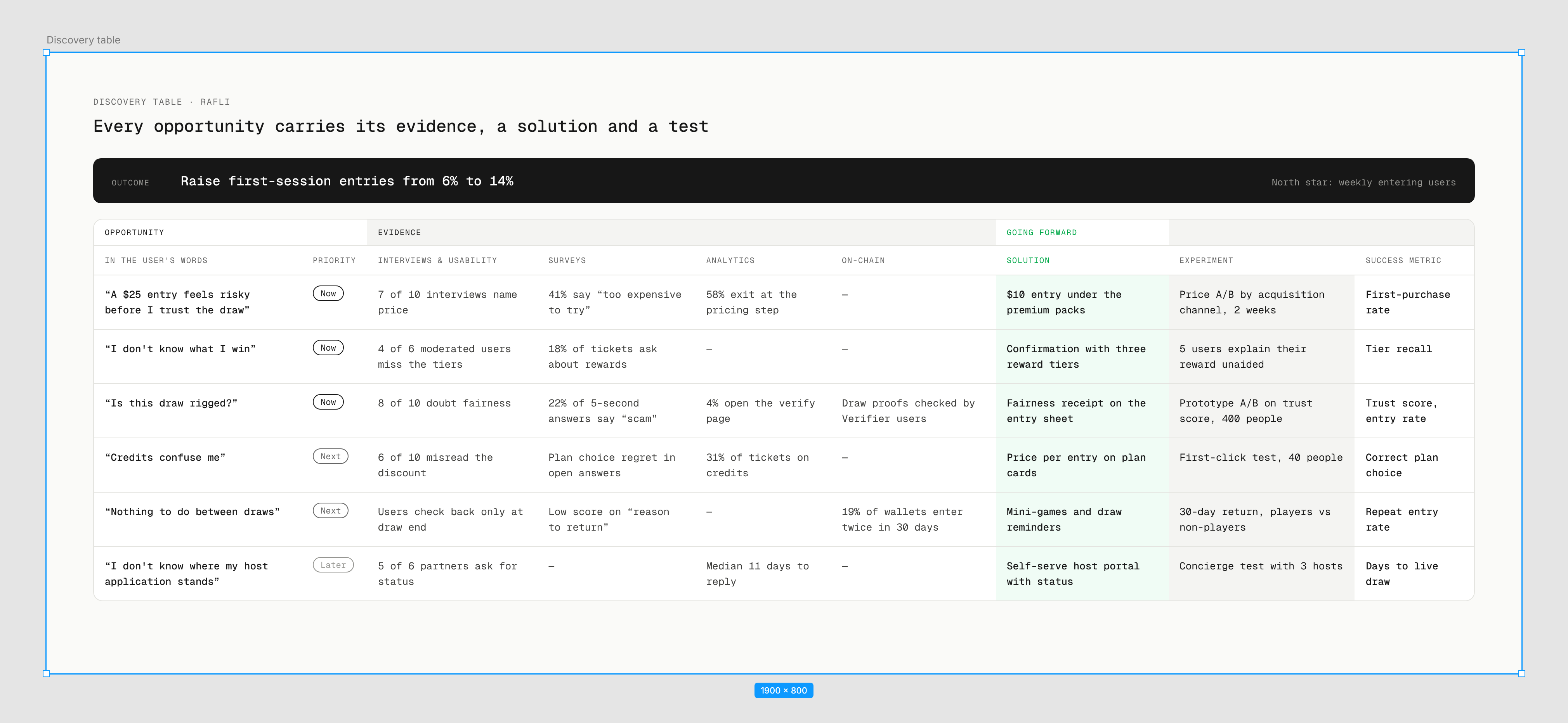
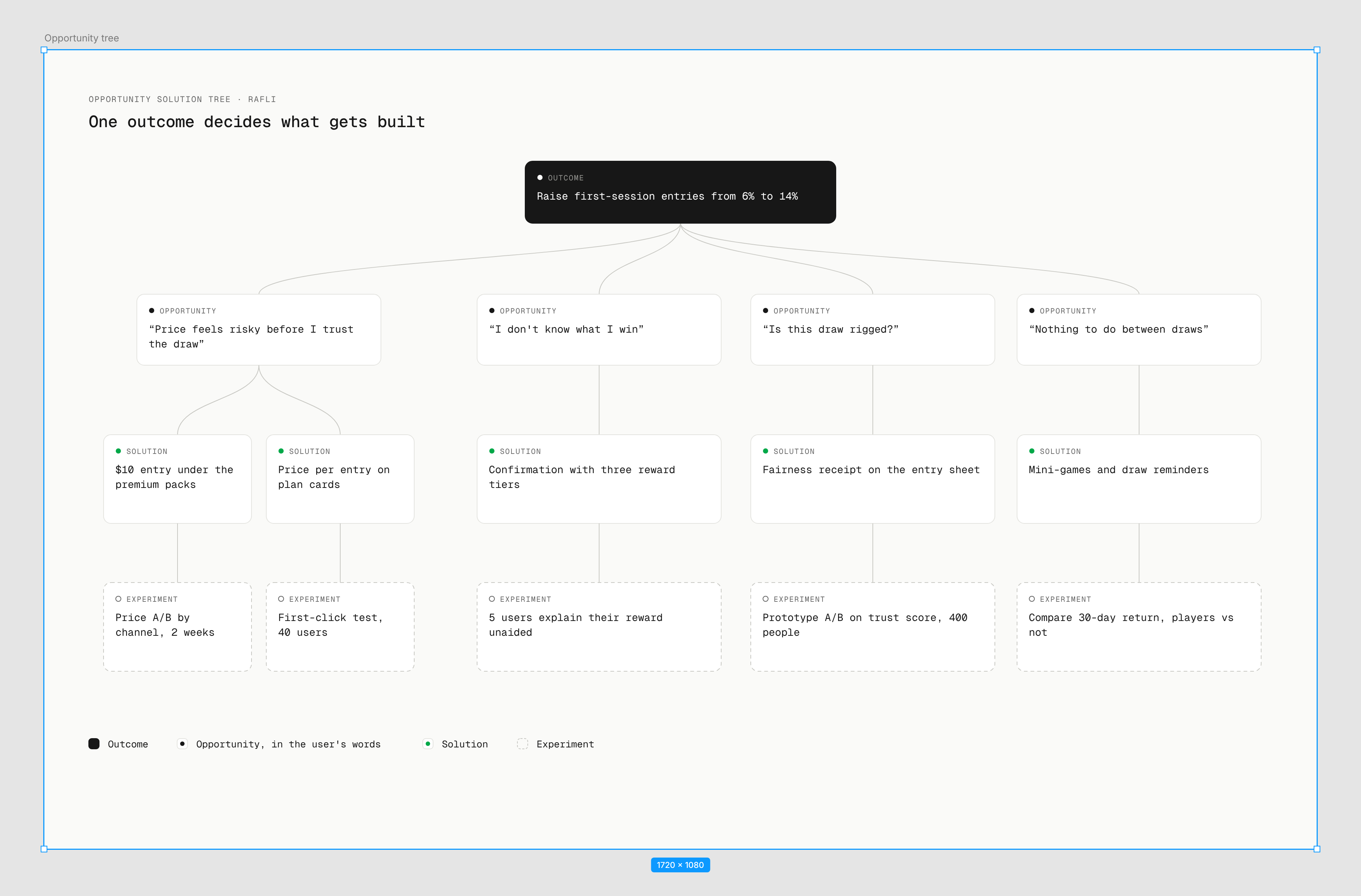
Synthesis: a discovery table and an opportunity tree tied to one outcome, more first entries. Every opportunity carried a test, so hypotheses were verified in short, fast cycles.
2. Pricing argued in the room
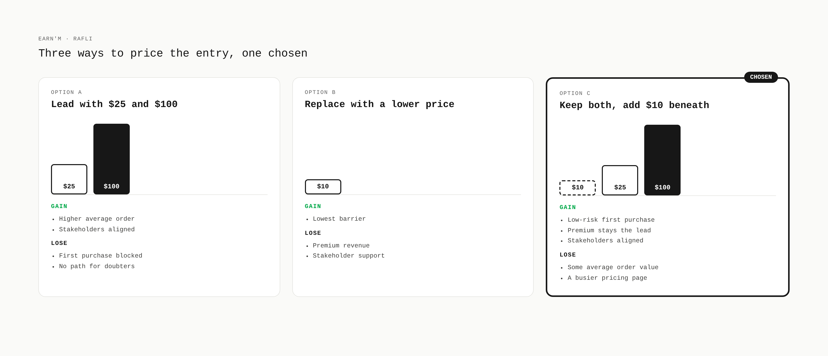
I sat in the meetings on how to present, onboard and acquire users, and brought working prototypes instead of opinions, so each hypothesis could be tested fast. The business wanted to lead with $25 and $100. I argued to keep both and add an easier way in, because a high entry price kills the first purchase before the product proves itself. I also pushed for pricing per acquisition channel.
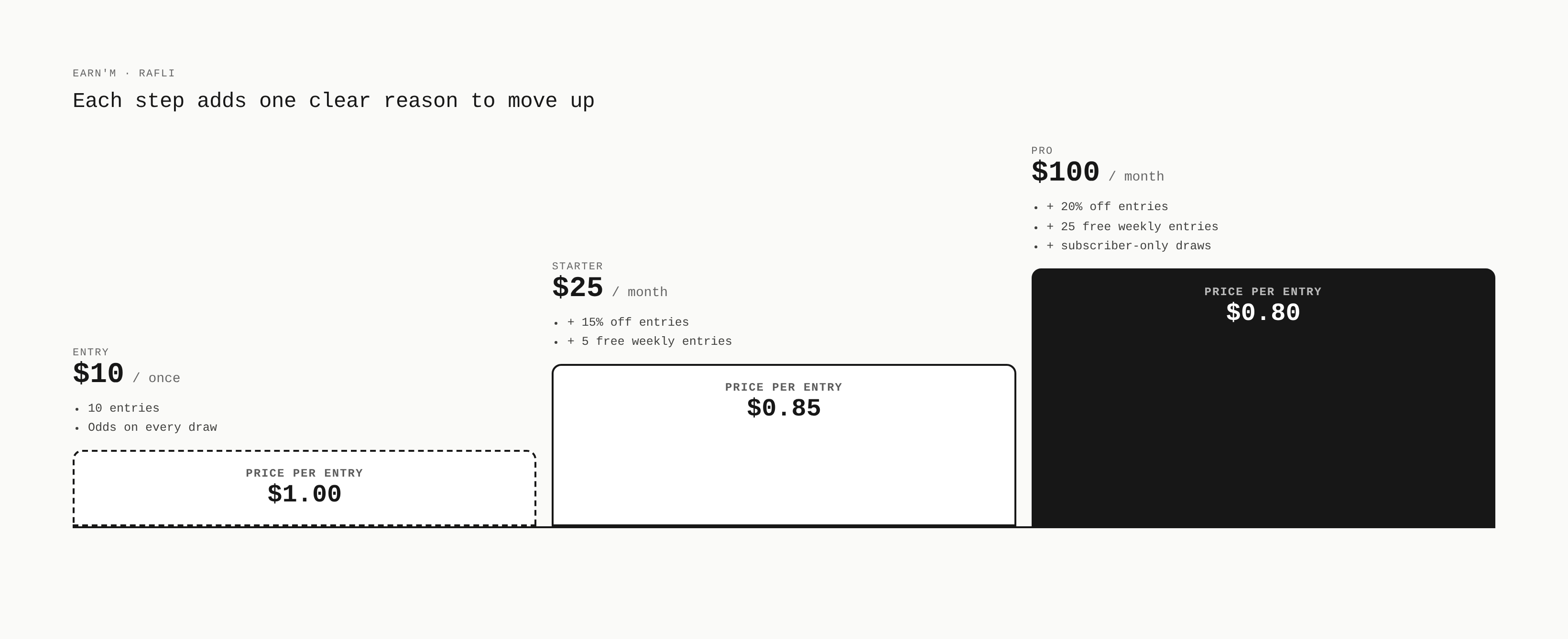
Both shipped: a $10 ghost-button entry under the main packs, and channel-based pricing.
How I would build the pricing with full evidence:
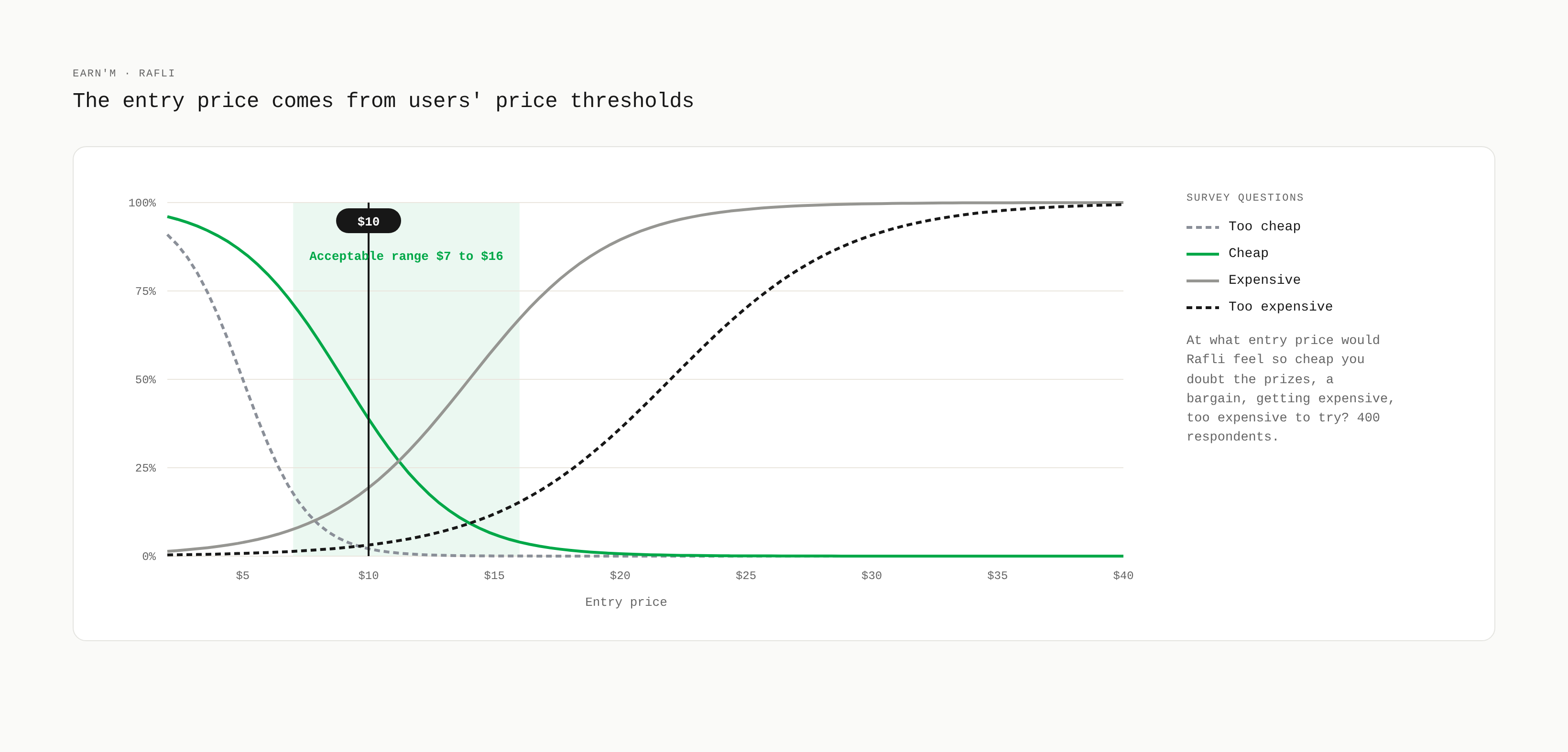
- Willingness to pay: ask users at what entry price the draw feels too cheap to trust, a bargain, getting expensive and too expensive to try. Then test specific prices one at a time.
- Package design: show small sets of perks and ask which users value most and least, to see what drives the choice
- A good, better, best ladder with one value metric users understand: price per entry
- Unit economics per channel: cost per acquisition, first-purchase rate, 90-day revenue per user, prize cost against entry revenue
- Competitor benchmark of entry prices, free entry routes and subscription perks
- Live tests: price A/B by channel with a holdout, read on first purchase and 30-day revenue, guardrails on refunds and chargebacks
- Ethics: honest anchors, no fake countdowns, free entry with equal weight
3. A closed design-to-code loop
One freelancer could not keep pace, so I went hands-on: design, rapid prototypes, frontend and releases, shipped to GitHub's staging branch for engineer review. I worked across three roles: designer, frontend developer, project manager.
Ideas started in Claude, with iteration and research, then got polished by hand in Figma, then moved into code to test in real material. Some started in code and came back to Figma for direction. Each step was a fast iteration to verify a hypothesis before investing in polish.
Mini-games
- Situation: few people came back after a first win, the top pain in the workshop vote
- Goal: give returning users a reason to open the app between draws
- Constraints: no near-miss effects on a loss, one free play a day with credits after that, every state built from the shared system
- Process: three mechanics, scratch card, coin flip and mystery cards, each designed with idle, playing, win and loss states, then built as a playable prototype, iterated fast to verify the hypothesis and test interaction feel and animation
- Result: a playable prototype taken from development to production
Entry confirmation
- Situation: reward value was unclear at the moment of decision, and first-purchase engagement needed a stronger close
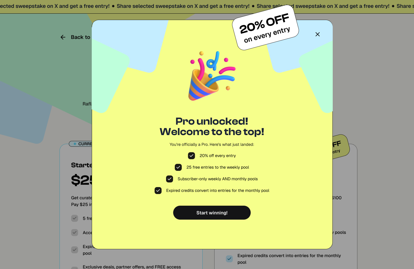
- Goal: make the reward tier clear right after entering, and give first-time buyers a reason to come back
- Constraints: payment states had to stay clear and honest, three reward tiers had to read as a hierarchy at a glance, animation could not slow the flow
- Process: mapped the flow from payment through processing to three tiers, then built each as a state with animation, a confirmation screen and notifications, and tuned the timing through fast iterations in the prototype
- Result: a playable flow, not yet usability-tested (see Reflections)
4. One system, four homes
I moved scattered files into a replicable system, reused instead of rebuilt. The system kept moving to a better format as the team grew:
- Figma library: styles and components, nothing redrawn
- Storybook: decisions encoded as real, testable components
- Markdown spec: rules coding agents and teammates build from
- Mode.Inc brand system: the parent company extended the practice company-wide
Business, marketing and engineering prototyped on the same system with the spec. I reviewed, we fixed issues together, then shipped.
A design system isn't a component library. It's a set of decisions, written down clearly enough that a teammate or an AI agent can build from them without asking me.
5. AI workflow
- Step 1, Claude: iterate on ideas and research the problem before opening Figma
- Step 2, Figma: polish by hand, visual direction, hierarchy and copy
- Step 3, Claude Code: turn the polished design into working front-end, testing interaction feel, animation and states
- Output: functioning prototypes for fast iteration and hypothesis checks, then taken to production
- Agent context: the Markdown spec told agents which components and tokens to use
- Kept manual: visual direction, reward-tier hierarchy, copy
- Where AI went wrong: agents generated components outside the system. Fix: explicit rules and a component list added to the spec.
What I chose, and what it cost
Options: lead with premium, replace with a lower price, or keep premium and add a path beneath
Chosen: keep premium, add a $10 ghost-button entry
Gave up: some average order value and a cleaner pricing page
Options: keep polishing each design, or build the UI on simple principles and plain graphics
Chosen: simple principles and simple graphics, so ideas shipped fast and each hypothesis was verified before any polish
Gave up: visual polish on early versions. Refinement came after an idea proved itself.
Options: Figma as the single source, or code and a written spec
Chosen: a Markdown spec beside Storybook
Gave up: Figma as the master file. Review load moved to me.
AI education and onboarding through the design system
Business, marketing and engineering prototyped on the system with the Markdown spec. To scale the practice company-wide I set up, or scoped:
- A role-based AI program: intro session, building with the spec and agents, reviewing AI output, weekly office hours
- A shared prompt library and a starter repo with the spec, tokens and Storybook wired in
- Clear lines: AI drafts prototypes, variants and copy without review. New patterns, money and legal copy go through design review.
- A rubric for AI output: system components, all states, accessibility, copy rules
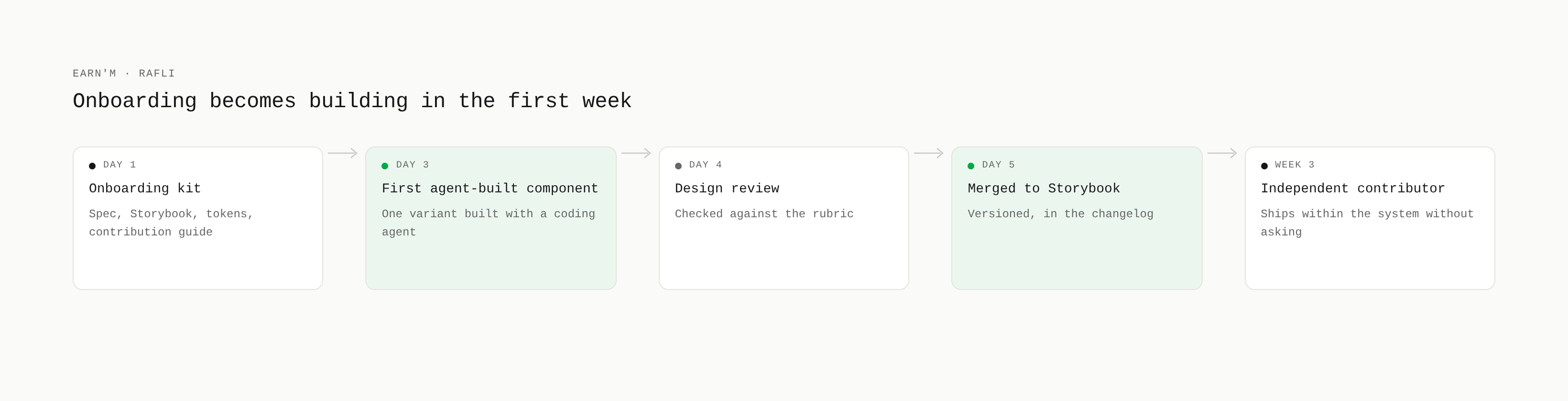
- Onboarding kit for new hires and contractors. First task: ship one component variant with an agent, reviewed by design.
- Metrics: people shipping prototypes on the system, review turnaround, share of AI output passing the rubric first time
Design became something the team owned
- Durability: the team kept shipping from the system after I left.
- Scope: from one product suite to the company-wide brand. The way of working changed, hours stayed the same.
- Team: three teams designed with AI assistance on the system and a shared Storybook.
- Business: the $10 entry pulled more first purchases. Directional, not proof.
What stayed unvalidated:
- Whether the $10 entry leads to repeat purchases, or only first ones
- The effect of channel pricing on its own, separate from channel mix
- Whether the confirmation flow made reward value clearer. The flow was never usability-tested.
What I learned:
- A prototype settles a debate faster than an argument.
- Fast iteration on simple UI beats continuous polish. Ship, verify the hypothesis, then refine.
- Instrument the funnel before changing price.
- A design system is a set of decisions written clearly enough for a teammate or an agent to build from without asking me.